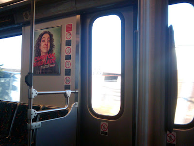
Go forth and conquer
So, I’ve been taking the train to work the last few months. It’s a bit of a hassle, but not overly so, especially for Los Angeles. It gives me some extra time to read, it’s not nearly as much trouble as it could be (did I mention that I live in Los Angeles?), and it can actually be quite interesting on occasion. So I’m consciously counting it as a small blessing in my life right now.
As you are no doubt aware, it’s kind of impossible to go anywhere or do anything in our modern world without being the target of advertising. Been to a movie lately? How many commercials did you have to sit through? While you were sitting in a seat you had paid to sit in, I might add. Grr, don’t get me started.
It will come as no surprise to you that there are advertisements on the Gold Line. I am shocked! I hear you say. Shocked, I tell you! Shocked and appalled. Well, get used to it. Most of the time they’re fairly forgettable ad posters, easy to dismiss or ignore. But recently there’s been a series that has caught my eye and actually made me smile…and think, I guess, just a little.
It’s winter, of course, or at least pushing into it, and when they say “‘Tis the season…” they mean not just comfort and joy but colds and coughs. We all love and need our little remedies, and one thing that’s never not in my bag is a handful of cough drops. Just, you know, in case. After all, it’s no good running out.
So this ad series is from Halls, the Mentholyptus people, and the tag line is “Get Through the Season.” This could be open to many interpretations, but I think Halls mean it literally–as in, “Do what you must to Get Through the Season. We’re here to help you.” Now, generally I’d be all skeptical and cynical about ads that are, after all, designed solely to sell me something. But this little series of ads is direct and appealing, and for some reason it has to me the ring of at least some authenticity.
The first ad poster I saw is the one pictured up top, and now here for your closer inspection.
The bold caption reads “Carry On, Good Lady.” The photo-based portrait is clearly heavily retouched and highly stylized, which (let’s face it) isn’t a huge surprise in an advertisement. But rather than Demi Moore or Angelina Jolie looking even more impossibly perfect than they already are, what we see here is a regular woman, someone who we might see on the street, in our place of employment, or even on the train (oh, hmm). But wait, there’s more.
The woman in “Push Forth, Fair Lady” is perhaps more prettily dressed, with layered sweaters and dangly earrings. But do we now sense a motif? Both are bright-eyed, scrubbed clean, and…dare I say…noble. Is the idea here that living a “regular” life, the kind most of us have, can be something to be proud of?
Ah, the first man to appear! And he looks proud and bold indeed, with eyes gazing into the distance, focused on his goal, his mission, which only incidentally includes not coughing so hard that he barfs up a lung.
Last but decidedly not least is this beaming young woman, the youngest figure of the four, with her perky bob cut, perfectly tweezed eyebrows and big, big eyes. Note that all are smiling, but none are showing their teeth. Teeth are kind of like the whites of your eyes–if people see too much of them, they’ll think you’re scary, or even crazy. Nobody wants to buy things recommended by crazy people. As an ad campaign, it’s more than slightly odd, but I think it works.
Just another morning on the Gold Line.
The “Hero – Carry On” ad campaign is by JWT, New York. All copyrights are held, I’m sure, by Halls (or whoever/whatever owns Halls). Ad artwork is linked here solely for illustrative purposes. No infringement is intended, only a weird kind of appreciation.
Chuck said:
Dec 07, 09 at 10:29 amYay! Wesly’s first post!
Not at all what I was expecting, yet exactly what I was looking for.
😀
Wesly said:
Dec 07, 09 at 10:53 amI think what Chuck is saying is that it’s odd and quirky. And it is. Never fear, I shall also write about food and drink and travel and such. 🙂
Rocky said:
Dec 07, 09 at 1:01 pmI like it!
Diana said:
Dec 07, 09 at 8:57 pmWelcome Wes! A fine post, yes quirky but wise and entertaining. A wisequirk, if you will. Coincidentally I was a captive ad audience while on the Blue Line just yesterday, and also took note of this campaign. It gave me a chuckle for the very reasons you mention, and I took noticable note of the advertiser. Which makes it successful on several levels (even if the guy looks a bit like the freaky love child of Jon Lovitz and Joe Mantegna). Smart placement too considering that public transportation is a not unlikely, uhm, vehicle for germ transfer.
Daniel said:
Dec 08, 09 at 3:55 pmThis was awesome. I think that food and drink are great, as do we all, but more of this is welcome, and even necessary. One more reason why this blog is one of 3 cocktail-related blogs that I read. Bravo!
Now if we could just get you one of them new-fangled Facebook thingers, Wes.
Wesly said:
Dec 08, 09 at 7:00 pmFacebook, Facebook…wait wait, don’t tell me! I know this one. This is a Unix sys–oh no, that’s something else. Facebook, that’s that thing where people you’ve been glad not to be in touch with for 20+ years can now not only find you and send you messages but also hold you down and pour water up your nose until you agree to play Mafia Wars with them. Am I right?
Barbara said:
Dec 09, 09 at 7:37 amHow could you not mention their noses? All the models had large, red exaggerated noses. Halls is, of course, a cough drop used by people with colds.
dule said:
Dec 09, 09 at 7:53 amSpeaking of metro ads, I’ve be quite entertained by these, which for a while were all over the Paris metro. Not because they were particularly funny or good… mostly because they were just so ridiculous.
http://www.strategies.fr/grands-prix/201/grand-prix-strategies-la-poste-des-marketing-services-2009/laureat/773/enchanteur-pour-telelangue/
And as of recently, there is a new series…
http://www.lucfrey.com/Telelangue.html
However, of them all, I still want the t-shirt with the Paris Metro Bunny 🙂
http://www.chrisandkellynelson.com/images/paris/Paris_MetroBunny.jpg
I don’t care what the translation says…. I still think it’s warning you that the door may pinch your fingers… if you are a bunny!
P.S. Yay!… welcome Wes!
Wesly said:
Dec 09, 09 at 6:40 pmDule – oh yay, le bunny du Metro! I had no idea you could get a t-shirt. Must Have!
Barbara – ah yes, the noses. Honestly, I went back on forth on whether even to mention the noses. I wrote something, then took it out. Then it was back in, and ultimately back out. Certainly they’re what makes these images work as ads for Halls, and I’m sure Halls will be glad that we are in fact noticing. But in the end I just felt I’d be calling unnecessary attention to them. I’m glad you mentioned them, though. 🙂
Milo Bloom said:
Jan 21, 10 at 7:11 pmInteresting stuff. Is it just me, or does the woman in the first ad look like Illeana Douglas?